UX/UI
Project Overview
Timeline: 3 Weeks
My Role: UX/UI Research +Design
Team: Sara Bell + Michael Palella
Conceptual responsive web redesign for a local nonprofit in Chicago focusing on the user journey of making a donation.
Non Profit
Problems
01
02
03
Current web design left users feeling overwhelmed with crowded content and weak information architecture.
Voice and tone of the current sites UI left users without a sense of authenticity and credibility.
CTA’s & stylized text broke conventional standards and failed color contrast accessibility leading to friction in the user donation flow.
Solutions
User Research
To begin our research, our team conducted a total of
7 interviews with both a stakeholder in the organization as well as 6 potential user’s and an independent google survey.
User Research Objectives
How do users choose a non-profit to send monetary donations too ?
Why do users continue to engage with a
certain organization ?
Heuristic Evaluation
To set the framework for our redesign we conducted a heuristic evaluation of the current website to see where the current UI aligned and misaligned with the findings from our user research.
The current site offered a positive and whimsical voice. However, with the serious nature of their mission, the site lacked a sense of balance between a tone of playfulness vs. authority. Cramped text & illustrations created heavy sections alongside confusing IA within primary navigation.
CTA’s and select text colors failed contrast standards for accessibility.
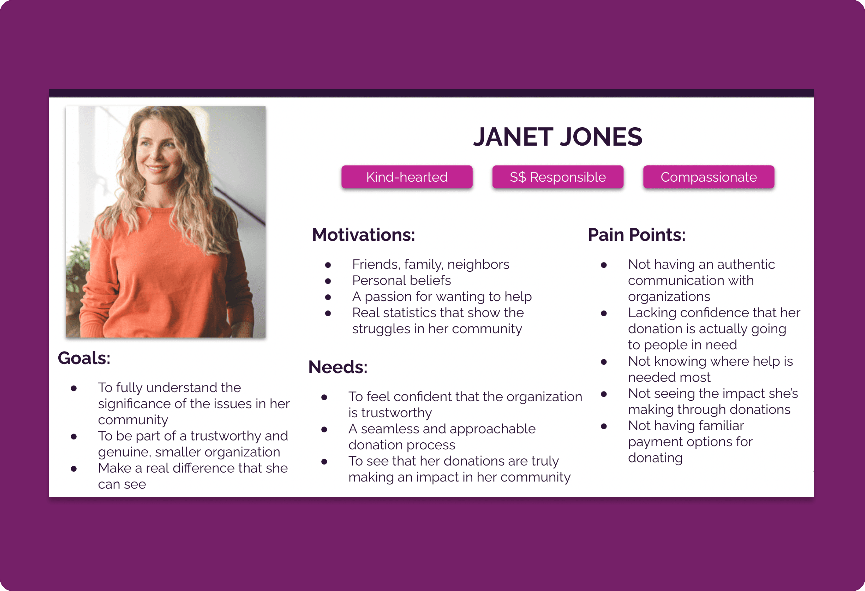
User Persona
Materializing our insights into a User Persona grounded our research and created a realistic connection that would contextualize our future solutions.
Usability Testing
To identify pain points in the information architecture and navigation of the site, we mapped out a user flow in which our user “Janet” recently heard about Fill a Heart 4 Kids and wants to learn more about their organization by exploring their website and possibly make a donation. Putting ourselves in “Janet’s” shoes the site didn't feel very trustworthy, with a donate button that takes you off the site with little information to give a user proper context.
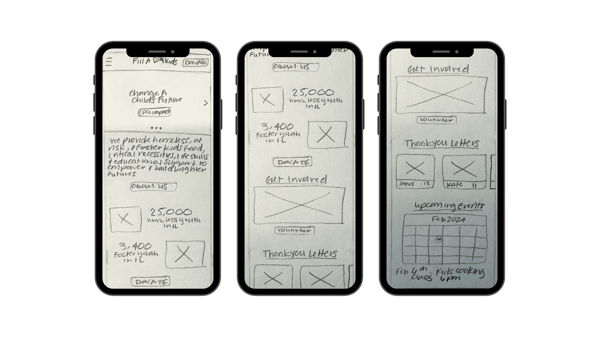
Early Ideation & Design
Mobile First Design + Paper Sketches
Mobile First Design + Low Fidelity Wireframeing
Once we had a better understanding of the primary user issues on the current site we need to strategize and formulate our solutions. Through the use of ideation exercises like “I Like, I Wish, What If” diagrams, card sorting surveys, and user journey explorations we were able to synthesize the features users would find most helpful and reconstruct the site map for a more informed navigation.
Design Process
Our team created a multifaceted approach to our discovery, design, and implementation process. Before we were able to devise any solutions for the current site we needed to understand their potential users and their needs and how to align them with the organizations.
By utilizing collaborative strategies such as user interviews, affinity mapping, feature prioritization, and detailed heuristic evaluations we were able to create user centric solutions that would drive confident user engagement with Fill A Heart 4 Kids resulting in donations that aligned with the needs of the business.
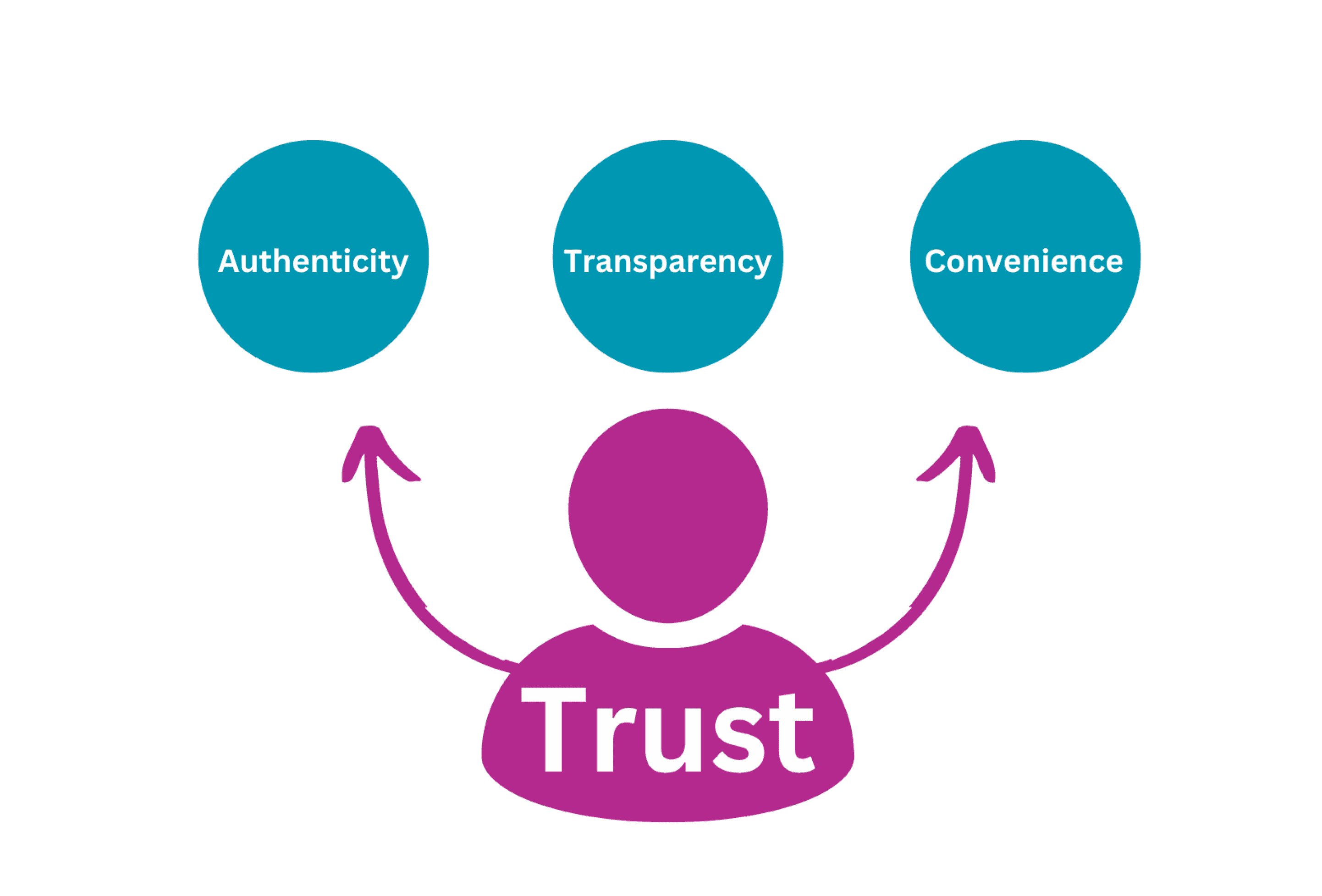
Key Insights
Once we compared the responses from both the interviews and survey we discovered that due to negative experiences in the past, each of our prospective users needed a demonstration of trustworthiness from
their ideal organizations to secure their donation.
Users believed that their organizations were deemed trustworthy when they were able to effectively portray authenticity, transparency, and convenience through their online presence and donation portals.
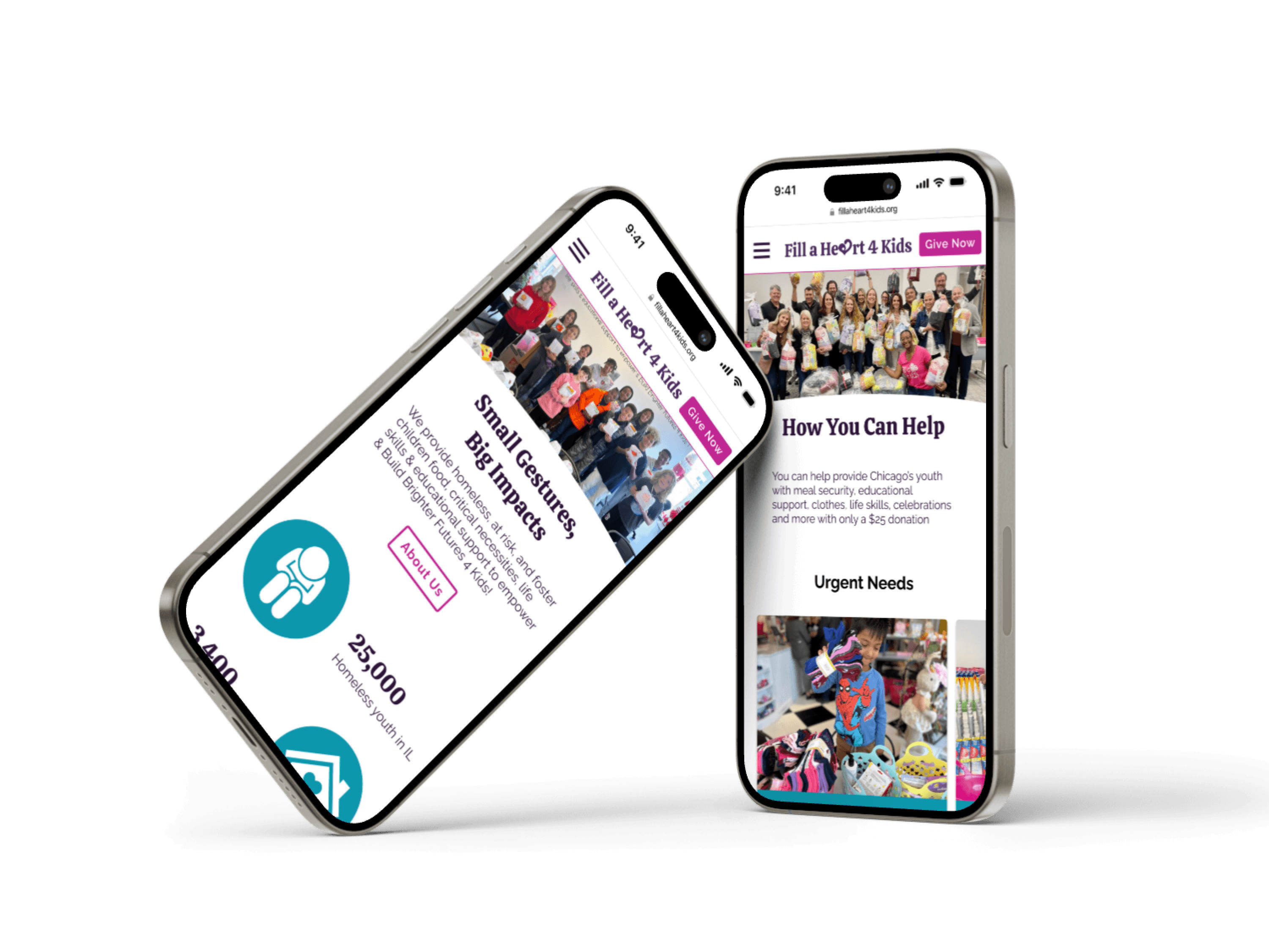
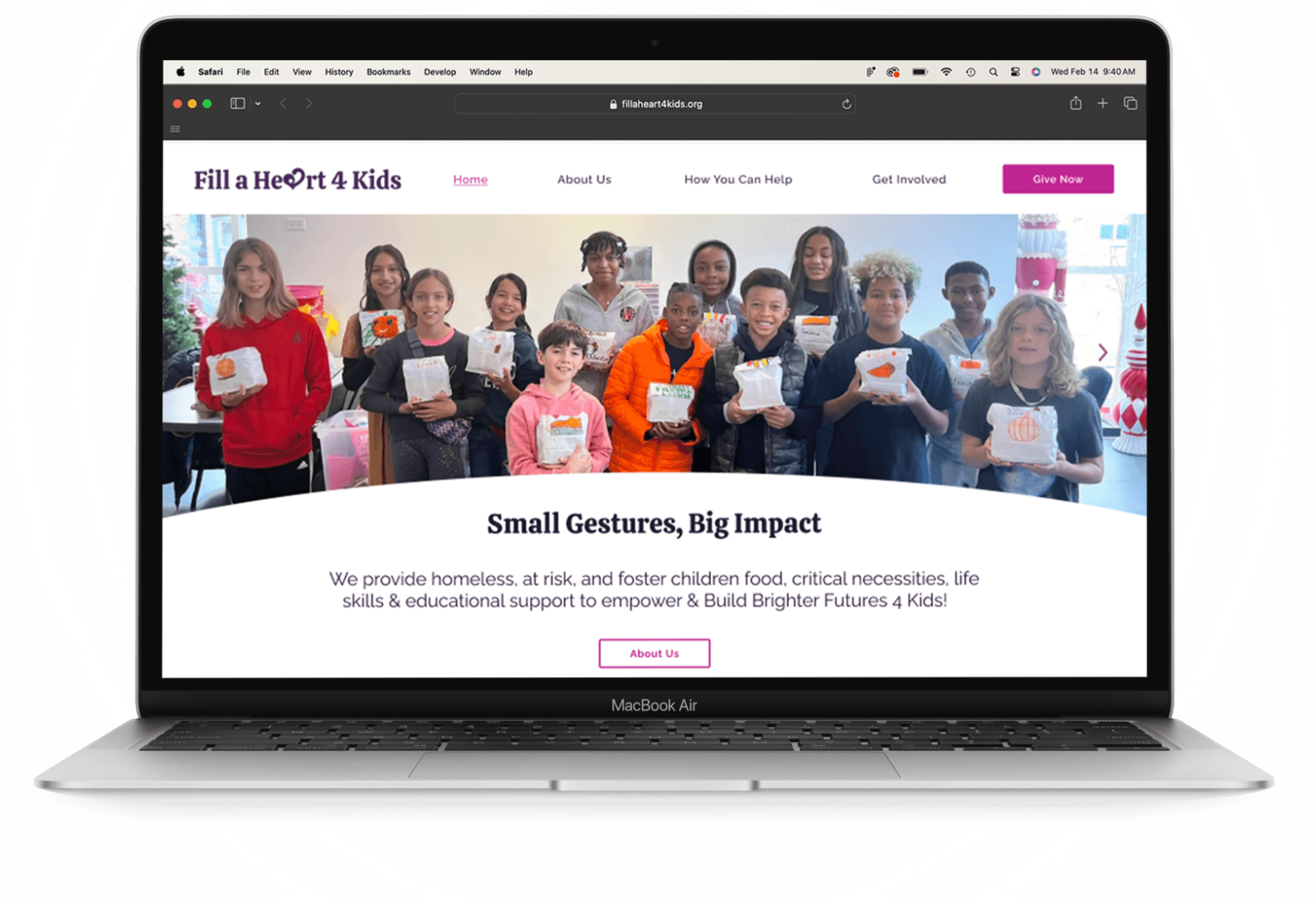
Web + Mobile Design
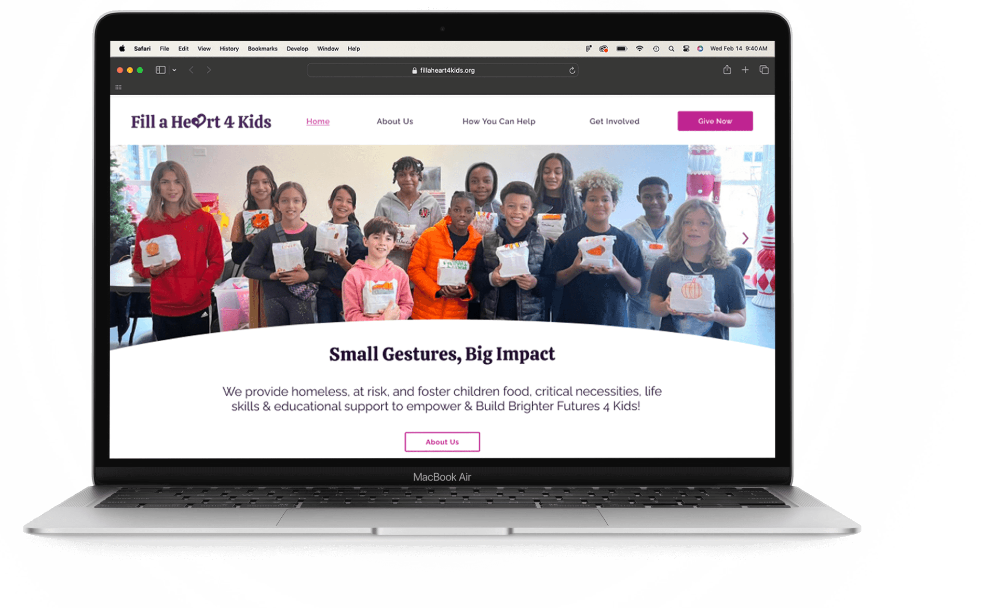
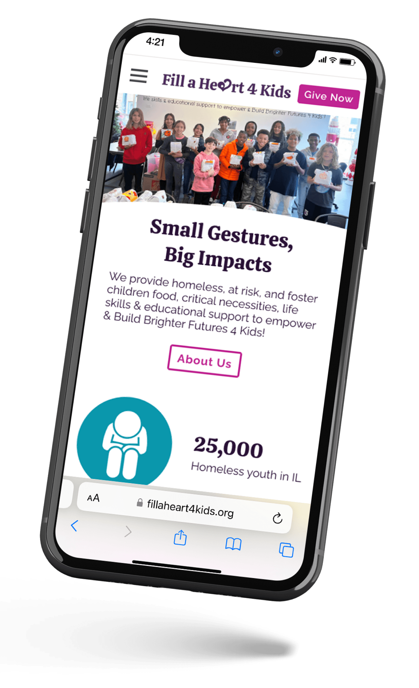
Fill A Heart 4 Kids
Redesign
01
02
03
Restructure page content with strong visual hierarchy and user tested information architecture.
Reinforce authenticity and credibility of the organizations site with company sourced imagery and legible font family.
Reimagined style guide with passing color contrast and conventional CTA’s.
#FFFFF
#C02592
#0D97AC
#
#842E93
#4D2960
Aa Bb Cc 123
Aa Bb Cc 123
Calistoga
Raleway
Color & Typography
High Fidelity Prototype
Let’s Connect
Best ways to contact me
kennethbkravitz@gmail.com
224-374-6086
Copyright KennyKravitz 2024
About Me
My Work
Contact

User Research
Usability Testing
Ideation + Design
Prototyping
1 Stakeholder
Interview
6 User
Interviews
10 Survey
Respondents